personal project: scatternote
how might we organize our ideas to better solve problems?
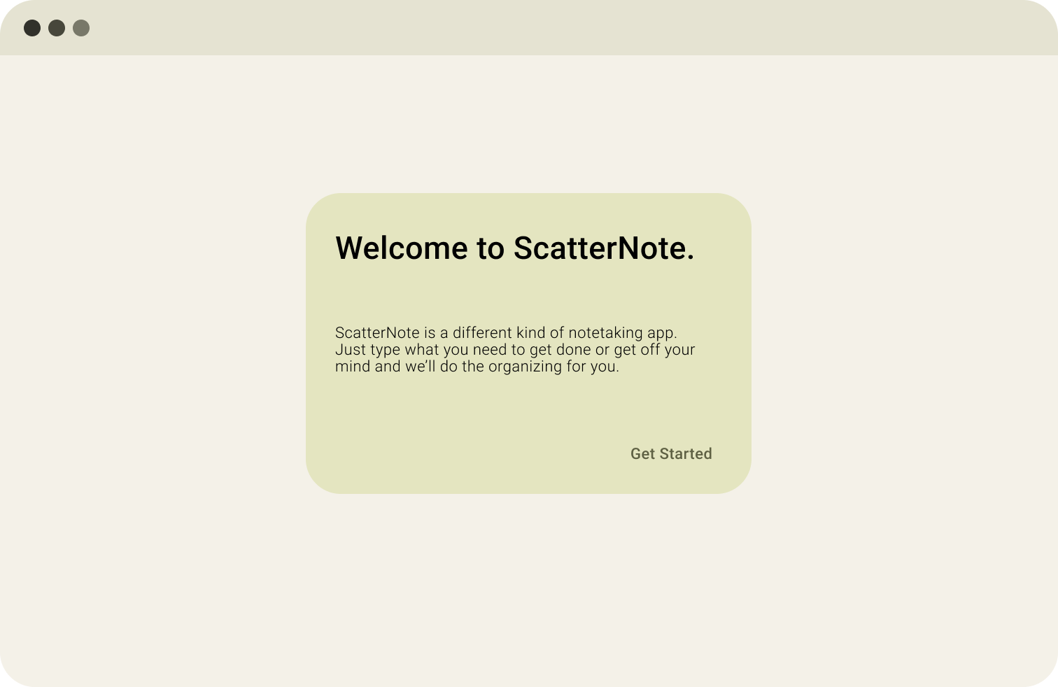
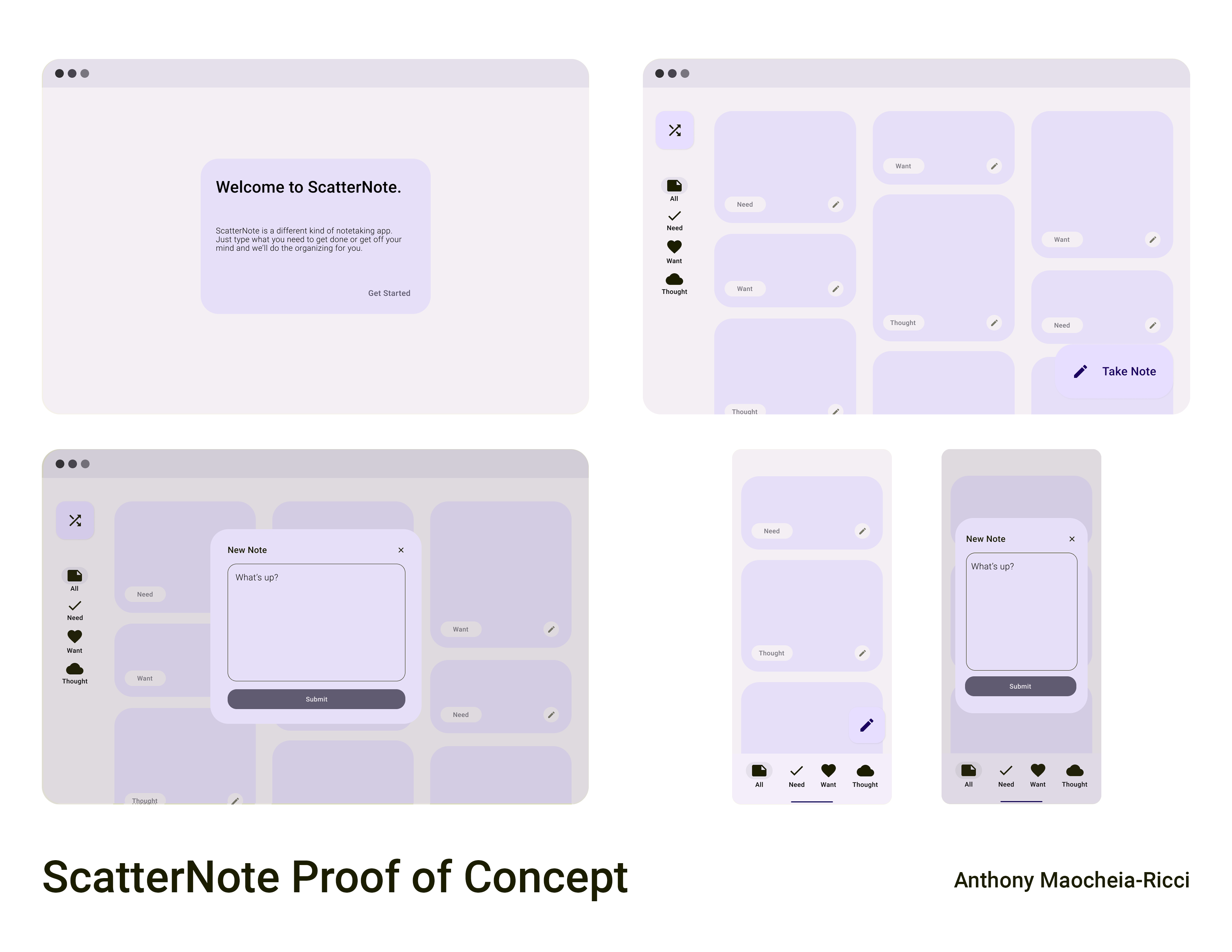
scatternote is a proof of concept design for a notes app that helps organize your ideas automatically. this was done as a first attempt of a "case study" before my first experience in ux.
background
throughout university, i've found myself to be the type of person who loves to write my thoughts down when i feel i'm overwhelmed with life. even in discussion with friends, we all tend to write about our feelings in some sort of way; some friends prefer to use a physical journal, some have a never-ending notes file, some use specialized notes apps, and others use a private or spam social media account.
in my personal experiences trying various options, i've made note of various pros and cons; from the full customization of a physical journal being inaccessible in the dark and requiring stationary to use, to a classic notes file having little customization options but easy accessibility, to the questionable privacy of a venting account.
design process
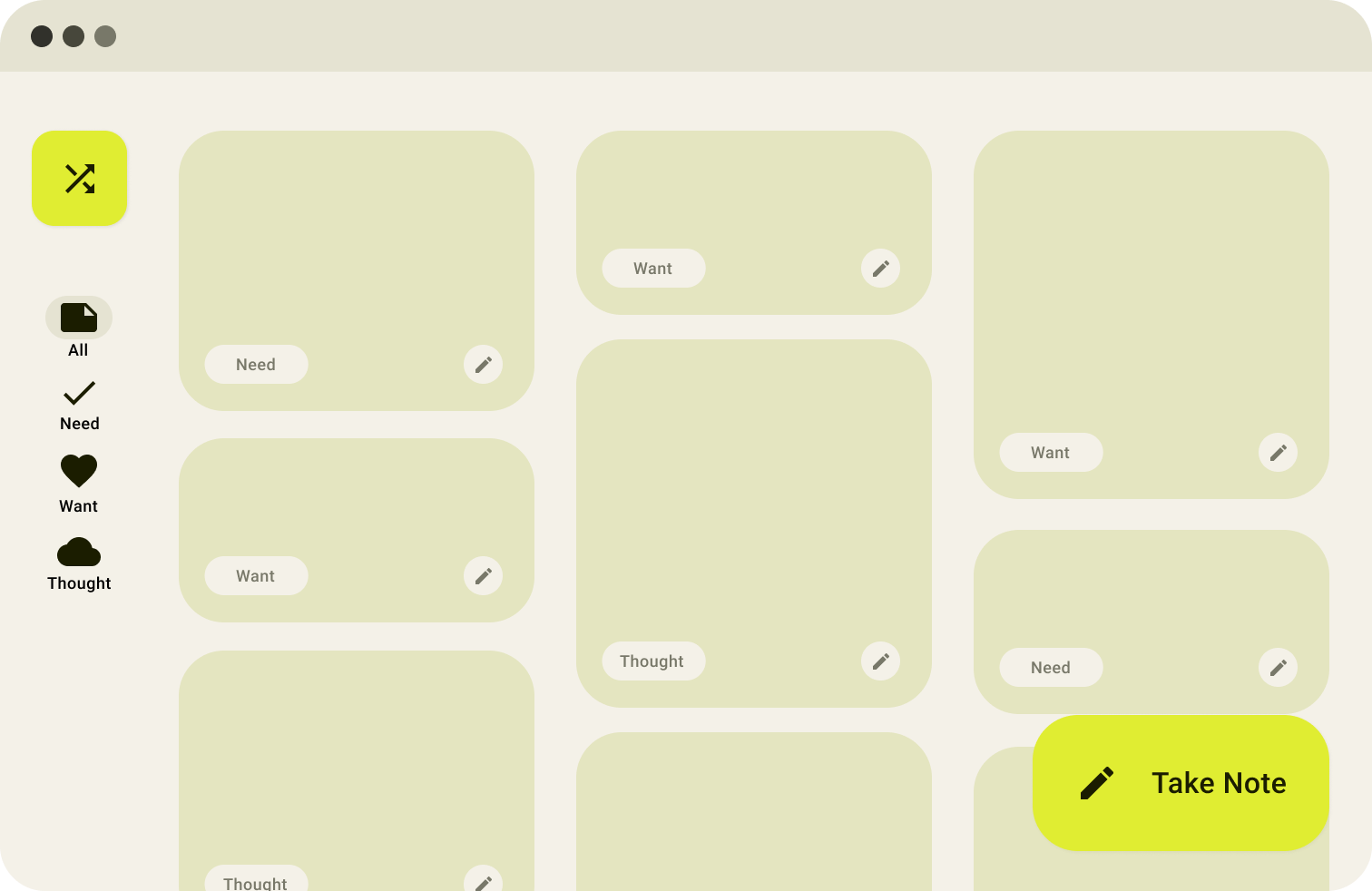
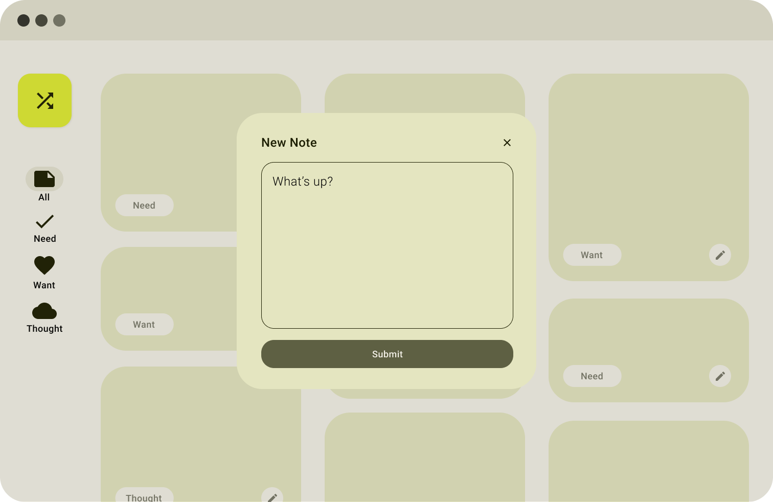
from the discussions and my own personal experiece, i was able to group the main types of notes into the categories of needs, wants, or general thoughts. however - sometimes we don't know how to group our thoughts categorically (leading to the never-ending notes file). this lead to the idea that the software would categorize it automatically for you into those groupings, regardless of the style of input (a long-winded paragraph or short three-line memos).
design concepts
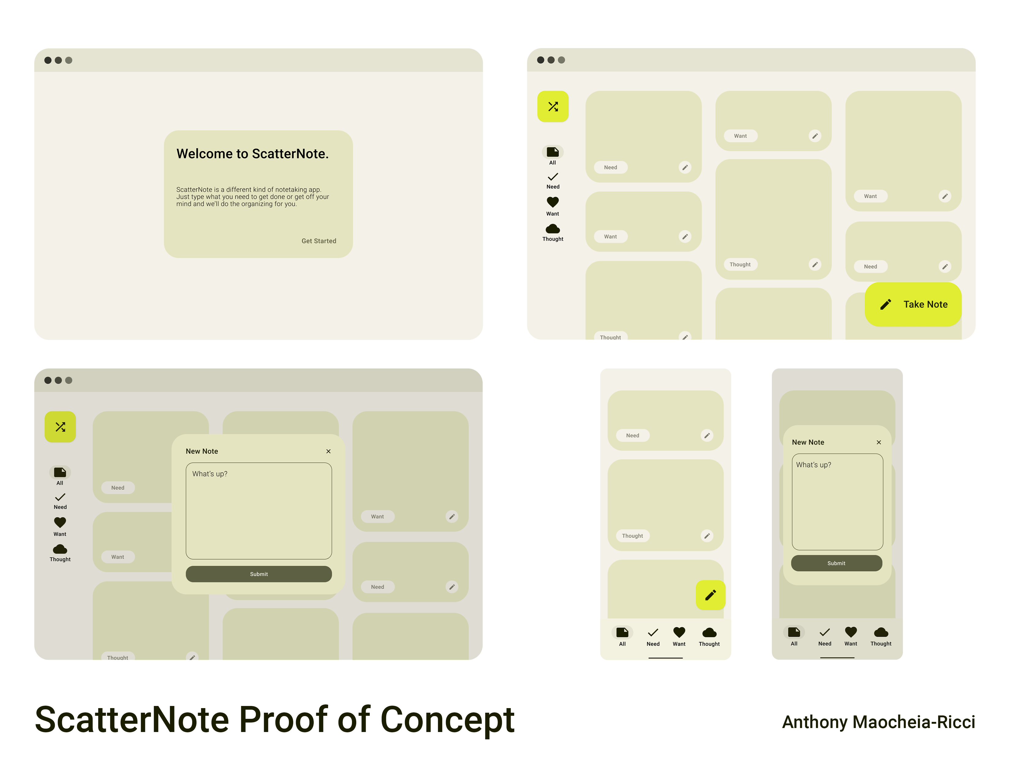
this proof of concept was created with material you (material ui 3) guidelines in mind, inspired by the interface on my phone! this design language is a delight to use on a daily basis, where you'll notice various ways the colours change in applications based on your phone's theme, adding a touch of personality to your personal notes app.
the frames can be seen here, or on the original figma file.
what else?
interested in other things i've worked on? you can read more about me and view more of my projects here!